
Unit 14: Digital Magazines
Magazines Genre


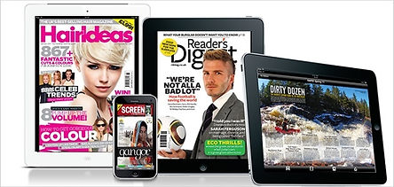
Platform Consideration


Magazines and DPS
LAA: Core assessment


LAB: Core assessment
LAC: Core assessment
Log 1

Log 2


Log 3

Log 4

Log 5
Log 6


Log 7
Log 8

Magazine cover
Log 1

Evaluation
For my rock artist, I had Tarik who was my artist to wear a black top which fits with my chosen genre of rock. In magazine cover, we see a mid-shot of him with an intimidating look which fits my whole theme of my chosen genre. I had a black curtain for my background which fits nicely and gives it a good look. I did change the colour contrast/exposure to fit it to my liking.

I mainly use fonts such as Myrid Pro which gives a professional, traditional look for majority of my cover line. For my headline, I used Herdrock font suits for my genre and gives off a ‘edgy’ look to it. Originally, I was going to use the font Cloister Black which is used in popular anime tv series Death Note but many characters were difficult to read it and didn’t look nice.
For my cover line, I originally having it to say, “I have to sing to survive” but didn’t give the hard rock I was aiming for, so I changed it to “I have to scream to survive” which fitted better with my genre. With my layout, I tried to recreate it from existing magazines cover and although it turned out alright, it didn’t look professional enough in my opinion.
The bold heading gives it an eye appealing look to it and fits with my target audiences. My aim with my magazines is to target my audience which generally males and females by using good colour cohesion such as purple and black which is the most common colour combination

Log 2

Log 3

Log 4

Log 5

Log 6

Log 7

Log 8

Double Page Spread

Evaluation
For my rock artist, I had Tarik who was my artist to wear a black top which fits with my chosen genre of rock. In magazine cover, we see a mid-shot of him with an intimidating look which fits my whole theme of my chosen genre. On Wednesday, I did off-site photo shoot in Safe House to with professional cameras such as Cannon 800 which gives my photos professional look and gives nice colour to my photo. I did change the colour contrast/exposure to fit it to my liking.


I mainly use fonts such as Myrid Pro which gives a professional, traditional look for majority of my cover line. For my headline, I used Herdrock font suits for my genre and gives off a ‘edgy’ look to it. Originally, I was going to use the font Cloister Black which is used in popular anime tv series Death Note but many characters were difficult to read it and didn’t look nice.
For my cover line, I originally having it to say, “I have to sing to survive” but didn’t give the hard rock I was aiming for, so I changed it to “I have to scream to survive” which fitted better with my genre. With my layout, I tried to recreate it from existing magazines cover and although it turned out alright, it didn’t look professional enough in my opinion.
The bold heading gives it an eye appealing look to it and fits with my target audiences. My aim with my magazines is to target my audience which generally males and females by using good colour cohesion such as purple and black which is the most common colour combination